Check your CSS source code order before shovelling on more CSS
I’ve been writing a new issue of The Index today and came across a bit of a spacing issue in our prose CSS rules.

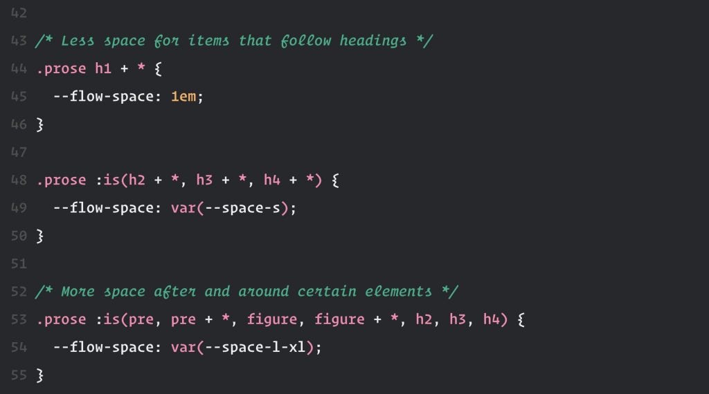
The culprit CSS is this:
.prose h1 + * {
  --flow-space: 1em;
}

.prose :is(h2 + *, h3 + *, h4 + *) {
  --flow-space: var(--space-s);
}
What that CSS does is look for heading elements and reduce spacing of any element that follows them, to create a nice section of content. It configures my favourite 3 lines of CSS I wrote about here.
The problem is, it’s overriding this rule which adds more space around elements such as a <figure>:
.prose :is(pre, pre + *, figure, figure + *, h2, h3, h4) {
  --flow-space: var(--space-l-xl);
}
Those two rules have the same specificity score as each other, 0, 1, 1. You can see them and how they are calculated here: first rule and second rule. The second rule appeared before the first in our source code.
This wasn’t a problem before, because most stuff we share has animation, we add a little motion warning, which then resets the spacing rule.
How did I fix it?
Well, admittedly my first reflex was moar CSS, but no more CSS characters were added. All I did was change the order of the rules in the CSS…

With that set, you can see the difference it caused:

Because they have the same specificity score, source order kicks in, which is why the second rule that appears wins.
What’s the lesson?
Instead of shovelling more CSS on the pile in these situations, check on that specificity first. If you need help with that, check out the specificity lesson I wrote on Learn CSS.
👋 Hello, I’m Andy and this is my little home on the web.
I’m the founder of Set Studio, a creative agency that specialises in building stunning websites that work for everyone and Piccalilli, a publication that will level you up as a front-end developer.
I’ve also got a CSS course called Complete CSS to help you get to a level in development that you never thought would be possible.