Desktop-down design is so painfully dated and damaging to user experience
There’s of course, some cases where design for desktop-first is essential, but friends, when you’re designing a responsive website, you have to give mobile so much more attention.
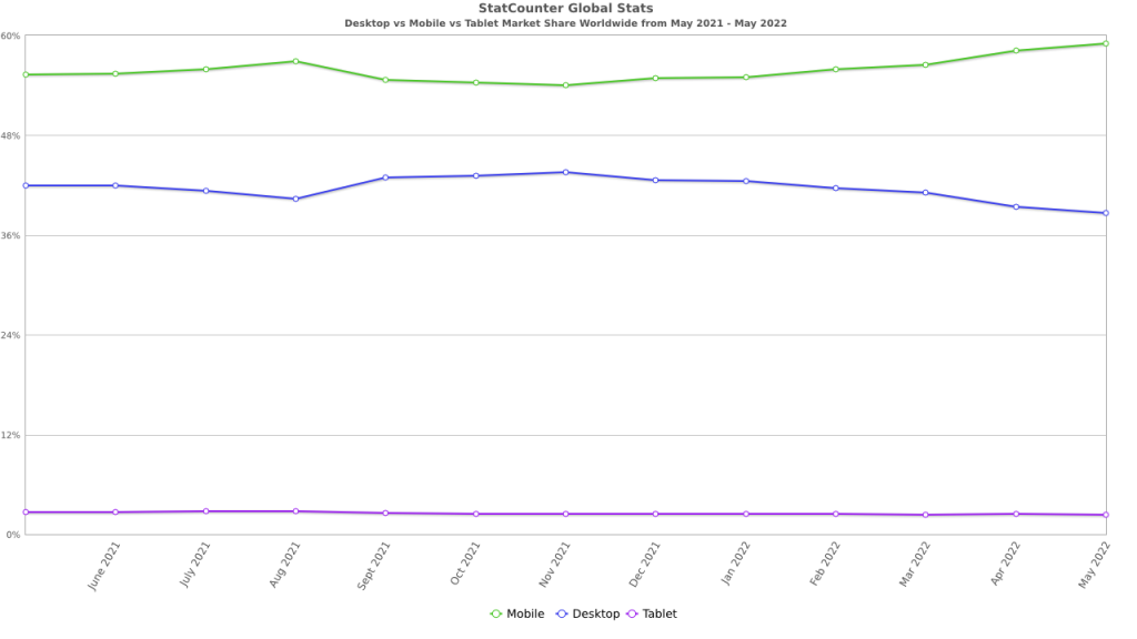
Check out this chart from StatCounter:

Now imagine starting with desktop, or worse, not even considering mobile. I hate saying “mobile” too, because a small screen does not equal a mobile device—it could mean anything. As I explain in my recent talk, there is so much fragmentation in device and viewport sizes, that picking just a couple is futile, but at least targeting the smallest viewport is a good place to be.
I’m telling you, when you do that, you will 100% improve how your website works for everyone, and that’s the most important thing.
👋 Hello, I’m Andy and this is my little home on the web.
I’m the founder of Set Studio, a creative agency that specialises in building stunning websites that work for everyone and Piccalilli, a publication that will level you up as a front-end developer.
I’ve also got a CSS course called Complete CSS to help you get to a level in development that you never thought would be possible.