How the CSS box-sizing property works
To celebrate International Box Sizing day—first celebrated by Chris Coyier—I thought I’d write a run-down of how the box-sizing property works. It’s one of the first things to trip you up when you’re learning CSS, so hopefully, this’ll be useful for those folks.
If there’s ever one really important thing to remember when writing CSS: it’s that everything displayed by CSS is a box. Regardless of how an element looks visually, it’s still a box.

Take the above example: it’s visually a circle—by proxy of border-radius—but it’s still a box, as far as the browser is concerned.
This is really important to remember when you’re working with CSS, but what’s even more important is understanding how these boxes are both sized and how they interact with their surrounding, sibling boxes.
Padding, borders and the content box
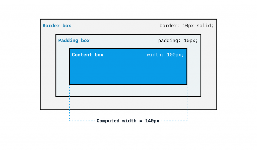
When we add padding and borders to an element: by default, their values will be combined with the computed width and height. This is because the width is applied to the content box in the default box model. This can be confusing—especially when you are first starting out with CSS.
.box {
  width: 100px;
  padding: 10px;
  border: 10px solid;
}

What happens here is your box’s computed width is actually calculated as 140px. This is because each side of the border box is 10px (20px combined), and each side of the padding box is 10px (20px combined). The width of the box only accounts for these inline sizes.
This is how the box model works, out of the box (pun intended), and it’s expected behaviour. Most of the time though, it’s preferable for this not to be the case, so we add this little snippet of CSS to give us some more sizing predictability:
.box {
  box-sizing: border-box;
}
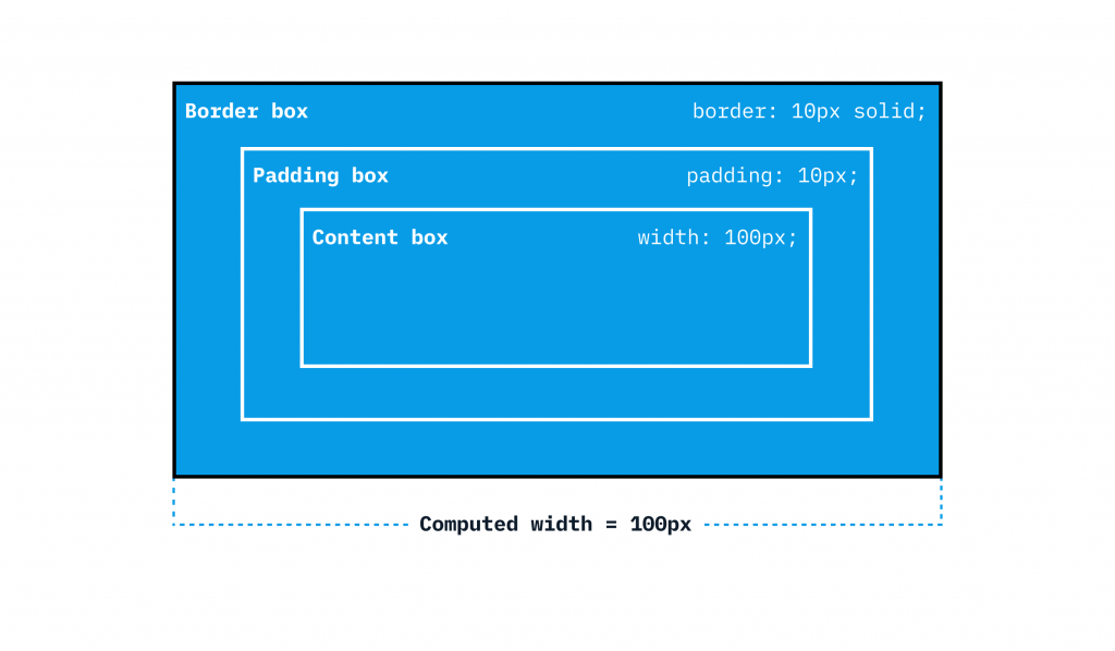
This completely transforms the browser’s calculation because what it says is “Take the dimensions that I specified and also account for the padding and border too, instead of adding them to the size”. What you get as a result, is a box that’s 100px wide, instead of 140px wide, just like you specified when you set width to 100px!

The most effective way of showing you this is with a demo. In this demo—which I made when I wrote the Learn CSS course—the box model parts are labelled. When you toggle the box-sizing: border-box switch to on, the content box, padding box and border box values are effectively ingested by the content box, because the width property is applied to the border box, rather than the content box.
Most folks add the box-sizing rule as a global selector to a reset, or default normalising styles, so to demonstrate a more complete example, this is how our CSS now looks:
/* Reset rule */
*,
*::before,
*::after {
  box-sizing: border-box;
}

/* Box component */
.box {
  width: 100px;
  padding: 10px;
  border: 10px solid;
}
What this example does is instead of just targeting the box with box-sizing, it targets every element on the page and any pseudo-elements. This means that everything you add to a page, you can guarantee that your boxes will be the sizes that you think they are. Setting global styles like this is a great way to keep your CSS as simple as possible, because that’s how it’s designed to work.
Wrapping up
You can read more on box sizing over on MDN, where there is some very good documentation. You can also read the box model lesson from the CSS course I wrote.
Setting box-sizing: border-box is such a life saver for front-end developers. The days of CSS before box-sizing: border-box arrived were very frustrating days indeed, so hopefully now you know how it works, sizing elements in CSS will be much less frustrating.
👋 Hello, I’m Andy and this is my little home on the web.
I’m the founder of Set Studio, a creative agency that specialises in building stunning websites that work for everyone and Piccalilli, a publication that will level you up as a front-end developer.
I’ve also got a CSS course called Complete CSS to help you get to a level in development that you never thought would be possible.