Improving “likes” on my site
I recently published an article that got quite a bit of attention and it resulted in a lot of “likes” at the bottom of the page. I pull likes from Mastodon, Twitter and anyone who posts a webmention “like” to my site.
First of all the block was ridiculously large…

Secondly, this particular post was loading around 40mb of images to render those likes 😱
The fix
The first part was leaning in to HTML’s built in lazy loading capability. This way, the browser only loads the images if they are in, or near the viewport boundary (depending on browser):
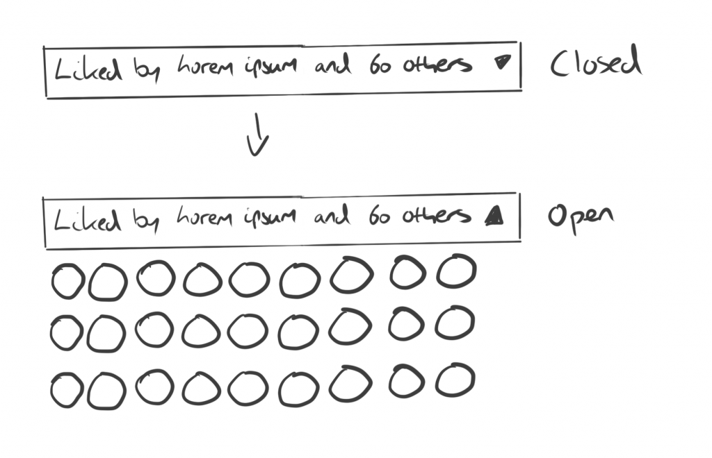
<img loading="lazy" src="<?= $avatar; ?>" alt="<?= $like->comment_author ?>" />Next, I got my sketch on. The idea for display logic was:
- If there are more than 15 comments, render a
<details>element, with the<summary> being an overview of the comments - If not, render the comments as they are

With the sketch done, I had some HTML and PHP logic to write:
<?php if(count($likes) > 15): ?>
  <details>
    <summary>
      <span>Liked by <?= $likes[0]->comment_author; ?>, <?= $likes[1]->comment_author; ?>, <?= $likes[2]->comment_author; ?> and <strong><?= count($likes) - 3; ?> others</strong></span>
    </summary>
    <!-- Avatars go here -->
  </details>
<?php else: ?>
  <div class="sidebar">
    <h3 class="text-base">Liked by</h3>
    <div>
      <!-- Avatars go here -->
    </div>
  </div>
<?php endif; ?>
This renders the <details> and <summary> if there are more than 15 comments, or renders the original <h3> and <ul> of likes, but this time, I use The Sidebar from Every Layout to render the heading inline with list.
Styling up the the <details> and <summary> smells like global CSS, using the CUBE CSS principles, so I added this CSS as high up as I could:
summary {
  display: flex;
  align-items: baseline;
  line-height: 1.2;
  gap: 0 1ch;
  cursor: pointer;
  list-style: none;
}

summary:hover,
summary:focus-visible {
  color: var(--color-primary-shade);
}

summary::before {
  content: '+';
  display: block;
  color: var(--color-primary);
  line-height: 0.5;
  margin-inline-start: -2ch;
  transform: scale(1.4);
  transform-origin: right bottom;
}

[open] summary::before {
  content: '—';
}

/* Hide default marker */
summary::-webkit-details-marker,
summary::marker {
  content: '';
  display: none;
}
This renders either a + or — depending on the closed and open state. A fun trick is because I’m using a monospaced font, I can use ch units for gap and margin-inline-start, to get a nice negative indent, just like I do with headings on this site too.
Also, this is why I’m using transform to scale the symbol, because then, the ch unit is still predictable. If I sized it with font-size, there’d be weird in-between sizes, so I’d have to do margin-inline-start: -1.6ch; or something.
The last neat CSS trick was this:
.comments .sidebar {
  --sidebar-target-width: max-content;
  --gutter: var(--space-xs);
}
I modified The Sidebar slightly by making it completely configurable with CSS Custom Properties:
.sidebar {
  display: flex;
  flex-wrap: wrap;
  gap: var(--gutter, var(--space-s-l));
}

.sidebar > :first-child {
  flex-basis: var(--sidebar-target-width, 20rem);
  flex-grow: 1;
}

.sidebar > :last-child {
  flex-basis: 0;
  flex-grow: 999;
  min-width: var(--sidebar-content-min-width, 50%);
}
Because our heading is the first child, I can use max-content to set the --sidebar-target-width, which means it’ll only ever be as big as the text itself. Lovely stuff.
And with all that, we get the finished products:


👋 Hello, I’m Andy and this is my little home on the web.
I’m the founder of Set Studio, a creative agency that specialises in building stunning websites that work for everyone and Piccalilli, a publication that will level you up as a front-end developer.
I’ve also got a CSS course called Complete CSS to help you get to a level in development that you never thought would be possible.